


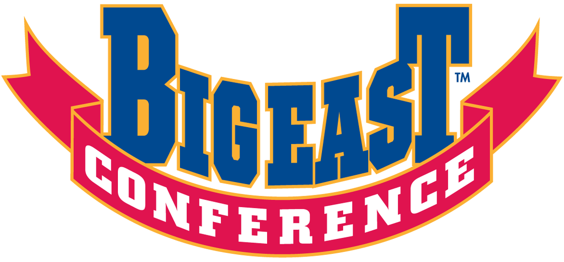
WHYYYYYY? Hey, remember the Big East logo? No, not the cool one below.
(via content.sportslogos.net)
No, instead, our new conference home seems to be aping our old conference's most recent logo iteration. This thing:

(via content.sportslogos.net)
Look how "angry" and "motion-y" it is! See how it represents progress and a sun rising over the horizon of a new beginning post-destruction part one (assumed). Red, white and blue are used to say "hey, we're America!" and those letters are likely slanted at a 16-degree angle, to represent the league's 16 members at the time (again, assumed).
***
So knowing how goofy and otherwise pointless that logo was. Why, ACC, did you go ahead and do this?
![]()
(via Brett McMurphy)
I mean, the old logo(s) weren't anything amazing -- though I did personally enjoy the map and seal thing they had going for awhile -- but why this? Might as well put some "woosh" lines on the left side. In fact, this would probably be the worst logo of the FBS conferences if not for the AAC and it's lopsided A with a star in it.
Despite the fact that nearly every other major conference logo has undergone a (fairly) dramatic redesign over the past few years, I just don't get why the ACC had to go ahead and do this. If nothing else, the old logo had some tradition -- or at least the illusion of it -- and that sort of helped tie together a league that stretches all the way down the eastern seaboard. Now, the ACC has seemingly decided that after taking everything that mattered in the Big East, they might as well take the logo too, just to hammer home the point. Of course we're happy to be in the ACC, but why does it have to make moves that mimic the Big East so often?
***
So again, WHAT IS THIS THING? And WHY does it exist? And if someone has InDesign/Photoshop skills, please feel free to submit a better option that this pointless mid-00s motion illusion logo.